By Alun Foster
Where it comes from
Objects in a scene reflect light (so we can see them) in a way that depends on their own surface colour and the colours in the illuminating light. Your eyes expect this to be “white” (though it often isn’t) and correct for this in “real life”: light must be a very strong colour before we stop seeing objects and start seeing art.
But our eyes don’t do a good job when looking at a photograph (which, of course, is always art). If the illuminating light source when the photograph was taken has stronger (or weaker) colours, this will affect the colours we see in the photograph, and this must sometimes be compensated for the photo to look “right”. The same is true if it is viewed as a print or on a screen of some sort.
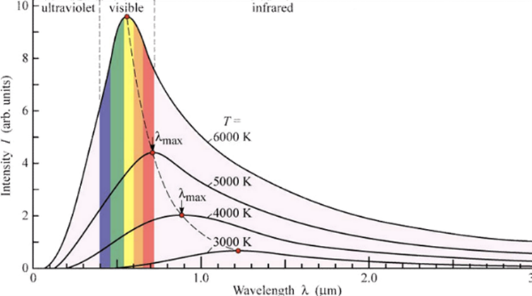
Most natural sources of light have a colour that depends upon their temperature. In the ideal world of physics, they are “black body radiators” of light. (Paradoxically, an ideal radiator of light is also a very good absorber of light, hence ‘black’). Like this:
 | Take a piece of metal and heat it up It starts to glow… First dull red Then brighter, yellowish, whiter Then blue-white |
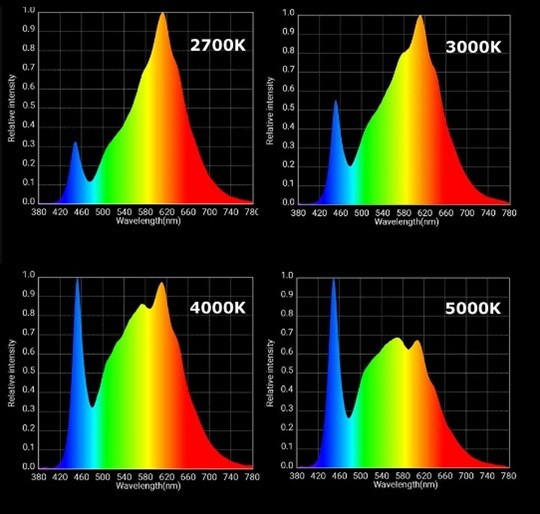
So, the colour of the light emitted is related to its temperature. We can say that light has a “colour temperature”, therefore. In reality, the only things to get that “blisteringly hot” are some very distant stars. Our own sun is quite a cool 5600 K, by comparison. This is why 5600 K (or close) is often used as the reference colour temperature.
I’ve made a table of some common light sources’ colour temperatures here, to get a feel for what this means in some scenes we can relate to.
| Light Source | Colour Temperature |
| Candle | 1000-2000 K |
| Tungsten Lamp | 2500-3500 K |
| Morning / Evening sun (clear sky) | 3000-4000 K |
| Fluorescent Lamps | 4000-5000 K |
| Electronic Flash | 5000-5500 K |
| Direct sunlight (noon) | 5000-6500 K |
| Cloudy sky | 6500-8000 K |
| Shade | 9000-10000 K |
A couple of things to note about this.
- Colours that we associate with “warm” actually have a lower colour temperature than the blue tints we associate with things being cool.
- Cloudy sky and shade show colour temperatures that are higher than that of the light source itself – our sun. The reason for this is the same as why the sky is blue. The air (and clouds) above us tend to reflect away the red tones, leaving the light looking more blue except when it comes at us head-on.
So, to correct for the colour of these light sources, to make them look as if they are close to our “standard “ 5600 K sunlight, we would need to “add some blue” (or take away some red) if they are too low, or “add some red” (or take away some blue) if they are too high on our colour temperature scale.
The effect of colour temperature (simulated)
In these photos, I’ve simulated the effect of various light sources on what we see in the scene.
Flash (indirect)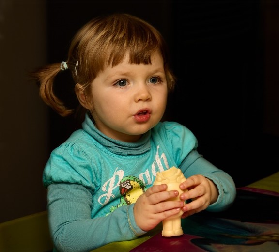 | Window (blue sky)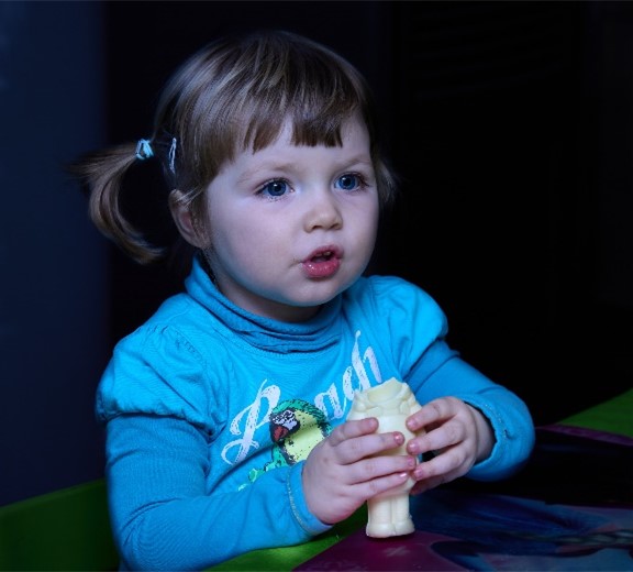 |
Incandescent lamp (tungsten) | Fluorescent light (“TL”) |
Electronic flash is designed to be close to our natural view of ‘white’. Though it can look quite blue if used directly, diffused flash is probably your best bet for getting natural-looking colours when indoors.
A shaded area (or indoors near a window pointing away from the sun) is basically being illuminated by a huge blue light – the (hopefully blue) sky, so tends to look quite blue as a result. Giving your subjects a blue complexion is not recommended.
Incandescent (tungsten) light, on the other hand, is quite definitely orange coloured, which makes our photos look correspondingly so.
Gas discharge light of the “TL” variety actually emit a spectrum of light that is far from ideal (see later), but we often see the result as having quite a ‘green’ cast (so, we have to “add purple” to compensate for the missing red and blue). More on this type of light source later.
Adjusting for White Balance – in camera
So, what can we do about all this? Especially if you shoot JPEG (though, also useful to get a good reference if shooting raw), your camera will more than likely offer you a number of “White balance” options.
Auto White Balance (AWB). This is by far the best to use for all general-purpose shots. Here, the camera analyses the scene and tries to compensate for any colour cast. It generally works well, except at extremes (tungsten, shade) or when there is no “white” in the scene to guess from.
Presets. Like the name suggests, these are pre-cooked compensation for a variety of fairly standard lighting conditions (tungsten, fluorescent, flash, daylight, shade, cloudy). Simply select a WB preset as appropriate when taking the shot. (Pro tip – you can select the “wrong” white balance preset to get some creative effects. Try “shade” or “cloudy” on autumn colours, for example. Or “tungsten” during “blue hour” for some spooky effects).
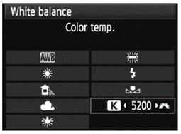
Other Options. Many cameras will allow a “custom white balance” to be selected. This usually requires taking a photo of a white object (paper, …) in the prevailing light, which the camera will then use as a reference for adjusting the white balance of pictures taken with the “custom” mode. Some cameras may also offer a feature where you can “dial in” a desired white balance colour temperature (though this is often harder to use well).
Adjusting White Balance “in post”
All image editors will offer some means of correcting for white balance, and most work in more-or-less the same way. While post-processing corrections for WB can be done on JPEG captures, the range of correction you can achieve before weird things start to happen is more limited than when using raw. (See insert to get a technical background for this).
| JPEG and raw JPEG format uses 8 digital bits per channel, whereas raw uses the full range of bits available from the sensor – usually 12, or these days commonly 14 bits per colour channel. This not only gives better precision in setting the level of each colour, it also gives more “overhead” for the arithmetic to work with before digital artefacts start appearing. Each extra bit effectively doubles the available range for adjustment, so going from 8 to 12 bits is already a 16-fold theoretical improvement. JPEG compresses the image data by throwing out a lot of colour detail (more than the luminance, or “B&W” part) – it is “lossy” compression. This lost information can be vital in colour-related corrections such as white-balance. Raw file formats use “lossless” (or sometimes, no-) compression, so all information for making colour-related adjustments is to hand. |
In all cases, the first step is to call up a preset (most programmes have them). Like the presets in the camera, they use a standard set of adjustments for each of the commonly encountered modes. From these, small manual adjustments to “get it just right” are also possible.

In more difficult cases, you can usually use a ‘dropper’ to pick a “white” colour reference in the image. This could be a white shirt, or paper item in the shot, or even a colour reference card that you include in a test shot. Pro-tip: “white” objects could potentially be “blown out”, so is best to choose a neutral grey as a reference. White reference cards usually offer a white or a grey surface.
A more awkward “pro tip” when really desperate is to use the white of a person’s eye as a reference.
When in post-processing mode, you can also use local adjustments for mixed lighting cases (defined by masks or layers, … the terminology may be tool-dependent).
Other light sources
All of the above assumes a fairly “uniform”, ideal light source, like a “black body” radiator. Such sources have smooth, predictable curves that describe the wavelengths (colours) of light they emit. No gaps or major spikes. Nice and smooth, like that in this diagram.
Many man-made lights are far from this ideal.
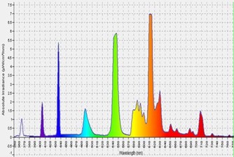
Such lights are far from ideal for photographing subjects where the colour rendering is of any importance. Certain colours are over-represented, or even completely missing (an object of such a colour would appear very dark in the photo). The better-quality lights, especially of LED lamps, are carefully designed and measured to have a “Colour Rendering Index” (CRI), and this should be higher than 95 (or, even better, 98).
For most applications, understanding the light source in a scene and using white balance correction is quite good enough for most applications. For best colour rendering, use flash if you can, and/or a high quality continuous light source (CRI>>95). If all else fails and the colours don’t work for you at all (for example, when there is a mix of illuinating light, this can be very tricky indeed), there’s always conversion to Black and White…
If your particular application requires very good colour rendering, you can go the whole mile and use a colour calibration chart. Such charts allow a complete colour profile of the light source and the camera sensor to be built, to compensate all of these physical side-effects. This is in fact quite simple to do, and is covered in the next section.
The ultimate solution – custom ICC profiles
Colour management standards for digital imaging are established by the “International Color Consortium” – ICC. “ICC profiles” are essentially correction tables that can be applied to different parts of the flow of image information as it moves through the processing chain – coming in from camera sensor through your favourite image editor and going out to the computer screen or printer.
Manufacturers of the software and hardware we use provide profiles for “the best possible average” for their specific products. These standard profiles are certainly adequate or most applications (with the notable exception of monitor/screens, though some manufacturers do now offer calibrated screens – it’s still worth while checking this though). For applications that require better colour rendering, a custom ICC profile can be created for each lighting condition, and for each camera’s unique response to colour.
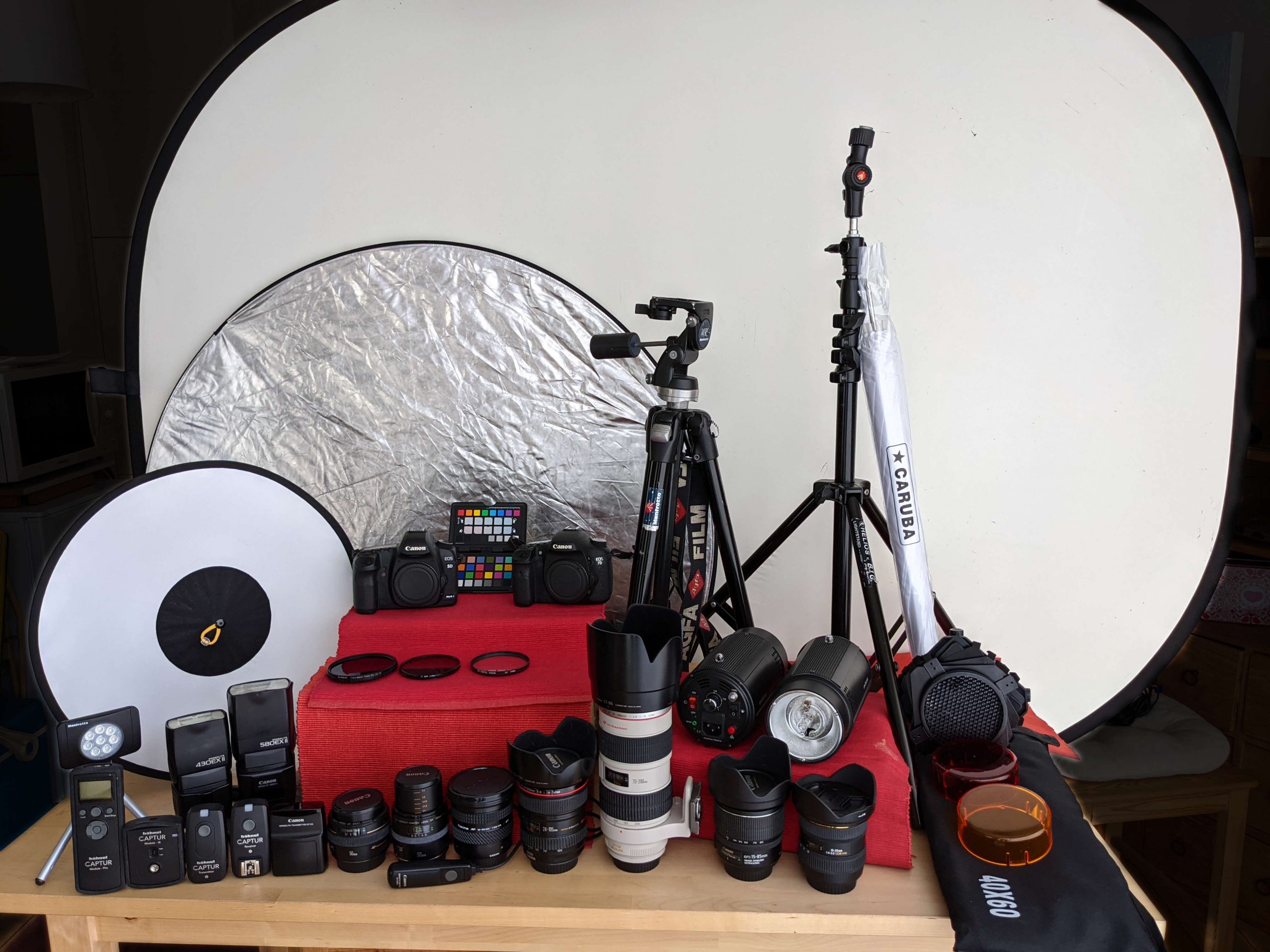
This may sound complicated, but manufacturers of such tools do make it rather simple to do. This article describes the use of X-Rite tools and Capture One Pro: other options are of course available, but all work in more-or-less the same manner. A brief step-by step guide follows.
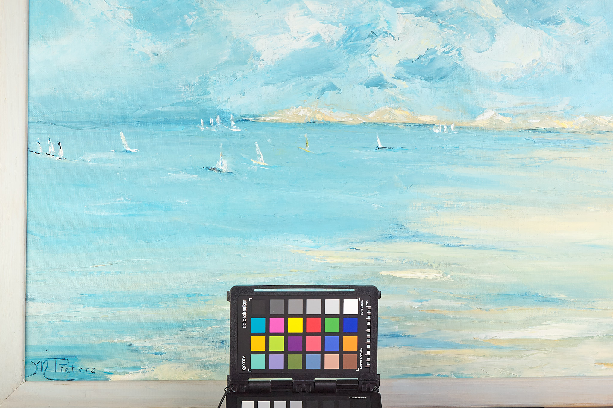
Step One – Create a reference image using the calibration card.
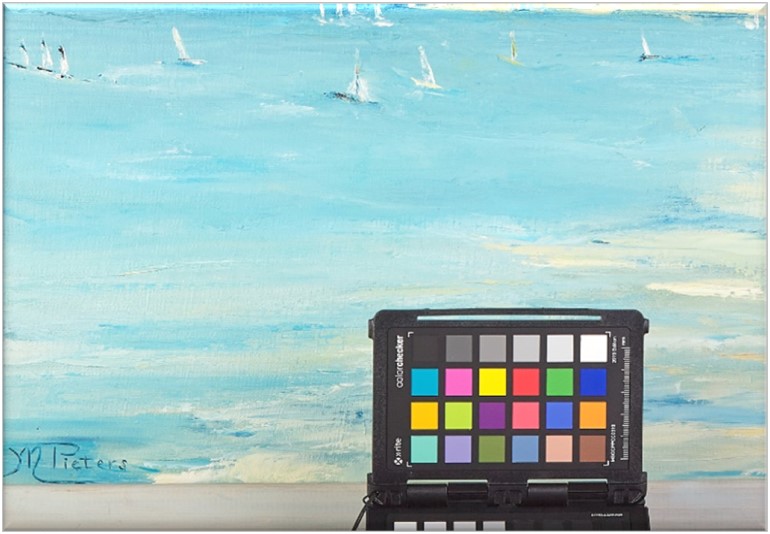
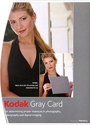
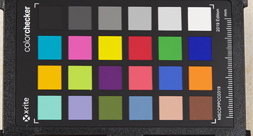
Calibrating the light source and camera starts by taking a reference image using a calibration card. While a grey card can be used to detect non-optimal white balance, a more detailed reference for many different colours is needed to compensate in more demanding situations. The colours are not random: In addition to grey at different levels, they include skin-tone colours, a variety of “nature” colours and some prime references.
When taking the reference shot, it’s best to bracket the exposure to be sure you have one where none of colour channels are “burned out” (which would confuse the later calibration steps).
This example shows a calibration set up for a studio environment (recording a painting, using flash), but the same principle applies at an on-location shoot of any sort.
Step two – import the test image into your image processors
Due to the huge variety of raw image formats, colour calibration tools prefer to take in a standardised image format, such a TIFF or DNG. Therefore, use your favourite raw processor to create a TIFF or DNG image. (JPEG from a camera has already been processed and much of the colour information compressed, so is not directly suitable for this type of work). When converting the calibration image, it is important the no additional processing is done when creating the TIFF (or DNG) reference. This means:
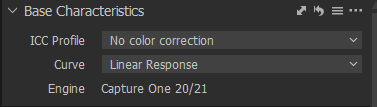
- Turning off any existing or default ICC profile. In Capture One Pro, this is done in the “Base Characteristics” tab.

Base Characteristics in normal use.
Settings required for the calibration image.
By selecting “No colour correction” and “Linear response”, the data from the camera sensor is in effect being imported complexly unmodified. - Colour correcting parameters in your editor must all be “neutral”. In particular, “White balance” control should be set to OFF or “None” if possible. The image can/should be cropped to include just the calibration card.
Step three – export the test image
Export the image as 16-bit TIFF (or DNG). For this, ensure that no profile or corrections are included with the file. A trick to do this in Capture One Pro is to “include camera profile”, which has in fact been set to “none” in step two above.
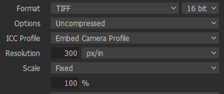
The output recipe format for Capture One Pro
You end up with a TIFF file that, unsurprisingly, looks like this:
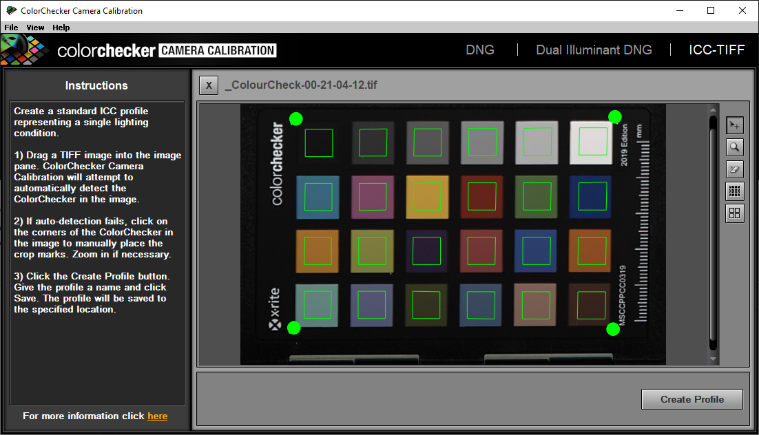
Step four – create the ICC profile
The example here uses the software delivered with the X-Rite Colorchecker Passport. Start the programme and drop your newly created reference image into its window.
The programme will automatically detect the corner markers and place its monitoring points appropriately on each colour patch. It may need little help; you can manually adjust the corners to get the best match.
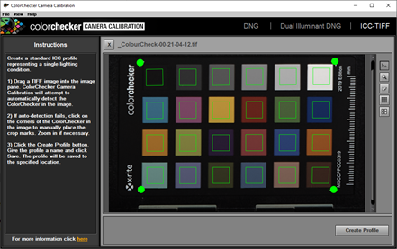
Test image in place within the Colorchecker software.
Simply clicking on “Create Profile” does just that. Give it a name of choice and it’s ready for use!
Step Five – using your new colour calibration profile
The newly created profile is used in place of the standard profile you may normally use in “Base Characteristics”, like this:
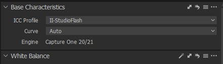
This profile can now be used when processing all images taken under the same conditions as the calibration shots.


 Select these for camera calibration
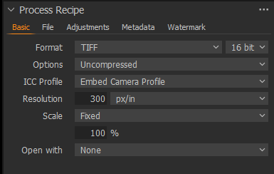 Output process