Blog Image

DAFOS Photo World

Why??

To catalogue my thoughts and experiences on things photographic and related topics, aiming to promote open-minded creativity and respect that hopefully contribute in some way to general peace and well-living.

Trigger happy

General Posted on Sat, May 30, 2020 23:43:34

Some time ago I bought a multi-purpose camera/flash trigger (at the last Photo Days, actually) but had not yet used it “in anger”. Recently, a squirrel came to say hello while I was eating lunch outside. Cute guy, but rather shy. These two events sparked the idea that I should take a foray into the wilds of our tiny patch of Brussels, to see if I could grab some shots of frolicking fauna – of course setting up a camera, a trigger and some bait to lure my unwitting victims…

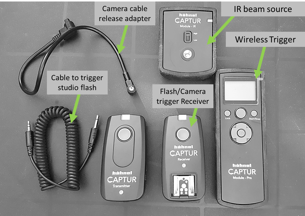
The trigger unit I have is the “Captur Module – Pro” by Hähnel, which comes with a source of infra-red (i.e. invisible) light to use with one of its triggering modes (if an object or animal breaks the beam, it triggers the camera). It can trigger a camera directly, like a cable release (using a cable to connect to the camera), or it can fire a wireless camera/flash trigger of the same brand, which has the added advantages of distance (gets the camera further away from the trigger than the length of the cable would otherwise allow) and – yes – it can trigger a flash/speedlight, too.

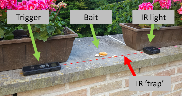
My “frolicking fauna” set-up had the trigger and the IR light source sat atop a wall, in the shade of some plant boxes, where I could also put some tasty morsels to lure whatever animate being that may fancy to trip the light (fantastic) and so take a selfie… Camera on tripod, manual focus (pre-focussed on the bait), Aperture Priority (Av) mode at f8 and leave it for a few hours…

The Captur unit can trigger the shutter or a flash using an interval timer (pictures at regular time delays), on ‘hearing’ a sound (burst balloons, anyone?), when a light flashes (slave to another flash, for example), or when the beam from a laser-pointer (not included) or the included IR light-source gets interrupted. Once triggered, it can be set up for various delays, repeats and maximum number of shots in a session. Very flexible and limited seemingly only by one’s imagination. The Captur module Pro is independent of the camera manufacturer/model, but you need to get the remote flash trigger specific for your camera brand (Canon in my case). See the Hähnel website (hahnel.ie, in English) for the various options.

The complete “Captur” kit I have

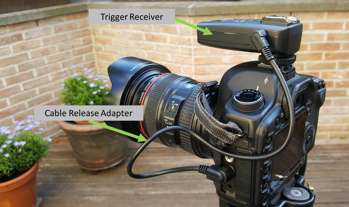
Working as a remote camera trigger is just that: set up the camera as you would if physically pressing the button and off you go. Using manual focus is probably best, and possibly manual exposure if the available light is fairly stable over the time you expect to take pictures. In my animal shoot case, the sun would occasionally go behind a cloud or my “trap” might get into the shadow of a tree as the sun moved around, so I opted to use Av exposure mode. Triggering a flash to capture some fast-moving event requires a dark environment with the camera set to “Bulb” (shutter constantly open), so that the flash itself sets the exposure time. Not so useful for my animal shoot, even at night – it’s never really dark in a city: that’ll be for another day.

The “trap” end of things
The camera end
The complete “shooting range”

And the result of this? Apart from some nice pictures of my own hand or other body parts, taken while I was testing the set-up, absolutely nothing. Zilch. “Rien de knots*”. It stood there all alone for 5 hours – no humans present to scare anything off – and not a single bird, let alone the squirrel, deigned to partake of the juicy treats I had so carefully selected to delight them. The only thing that triggered the camera was the interference of direct sunlight, as the sun moved around and shone into the Captur’s IR receiver … and filled the memory card (note to self – remember that for next time).

(* dialect from parts of Flemish Brabant, meaning nothing at all – literally).

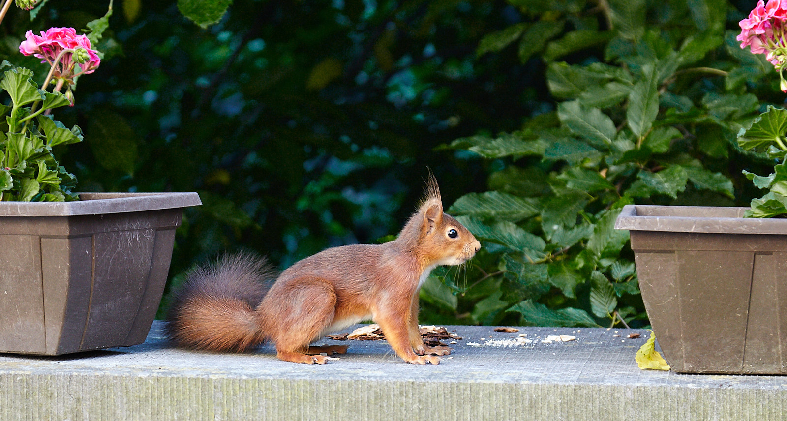
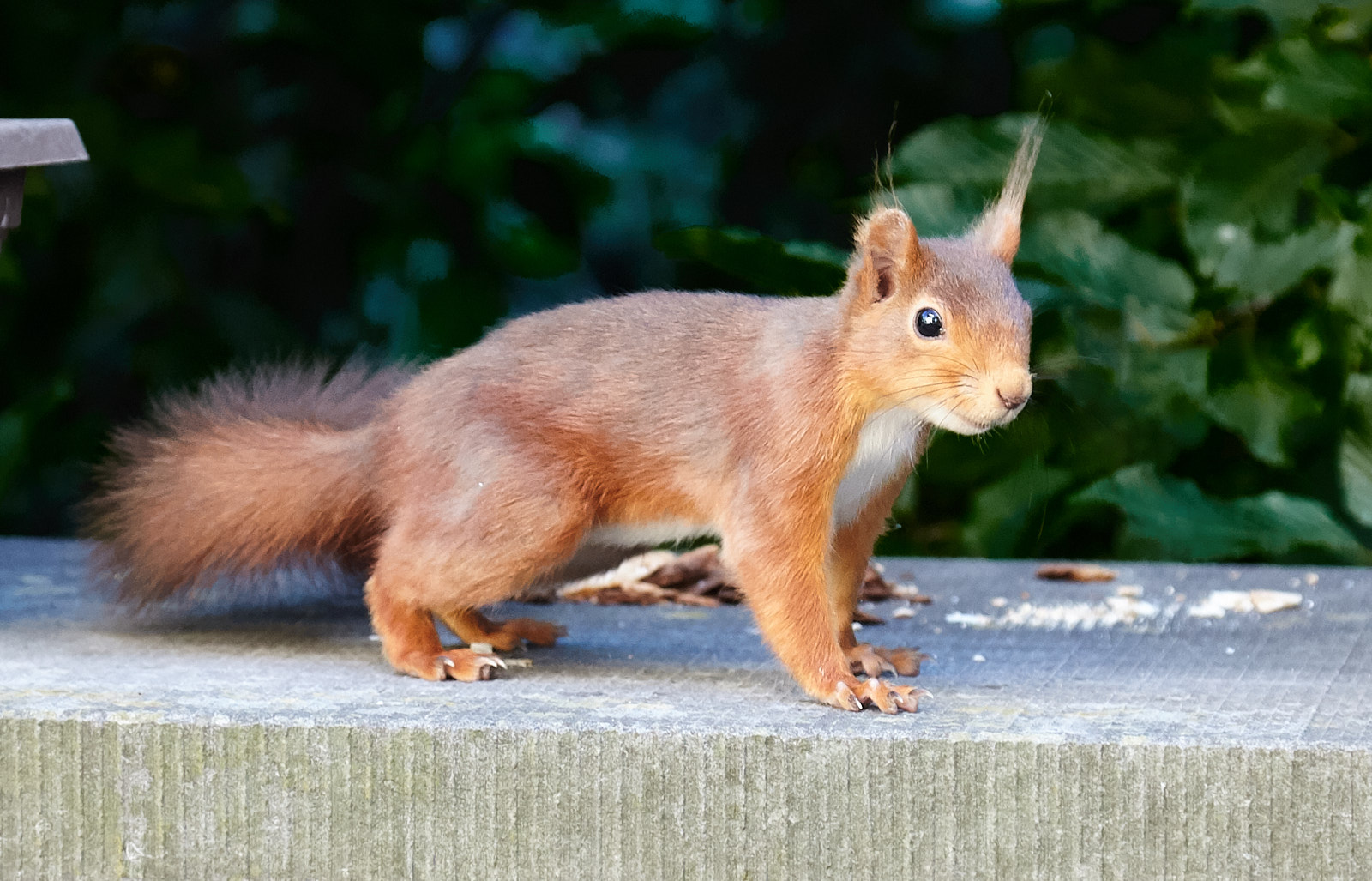
The following day, while seated quietly on the same terrace (with the same camera to hand, luckily) enjoying the evening air and actually writing this article, the unbelievable happened. Friend Squirrel came back for another visit, so I managed to get a photo of him anyway! Hand-held, no high-tech traps. Just plain-ol’ focus, frame and push the button…

Hello !
Sciurus vulgaris

I’ll keep trying though. More pictures will follow, I promise.


Photophilic conjecture in times of coronal isolation…

General Posted on Fri, April 17, 2020 12:16:43

Our concept of what matters in life has been changed by a Great Event. Not brought about by a large-scale disaster or human creativity, but by a measly strand of RNA with some 30k bases stuck inside a ball of grease with spikey proteins sticking out of it, no more than 120nm big, that someone (I think in the 1960s) thought looked like a crown or the Solar corona.

What first was reportedly a mild kind of ‘flu with some occasional but fatal complications very quickly turned into a Very Big Deal, with a pandemic putting many hundreds of thousands (if not millions) of lives at risk and closing down our usually oh so busy and oh so important activities. It’s scary and it hurts. It’s bringing us back to basics. It’s teaching us who really matters in our lives, as individuals and as a society. And also who and what are maybe less important than they sometimes want us to believe.

But in all this sadness, danger and confusion there lies opportunity to change things for the better. What things in our lives will become more important than before? What can we do without, and how can we replace the practical benefits some of these unwanted things in fact offer?

Until we can be in a position to actually act on this change, all we can do is dream or imagine what good may come from it. Or try to photograph it. Social media is already flooded with photos of “life in the lock-down”, most of them (thankfully) with positive messages for how to get through it, leaving the mainstream media to report on the human drama that unfolds around us. But what about “after”? Can we photograph now our dreams and aspirations for a plausible and sustainable future?

I suddenly feel a photographic challenge coming on…


Levels or Curves?

Things Digital Posted on Fri, May 31, 2019 20:06:41

Again, based on discussions in the Viewfinders club…

Once you get to the stage where you get your digital photos onto a computer and start working with “image processors” to make adjustments, a question one often hears is “what should I use – Levels or Curves?”. The Questionner is referring to different types of tool that can be used to adjust the rightness and/or contrast of an image. The Questionee’s standard answer is whatever suits you best”. Which is correct though not necessarily very helpful. I’ll try to elaborate on the difference here, without getting too technical.

All photo processing software tools are equal (though some are more equal then others), but they do tend to use their own names for things or operate in slightly different ways to what’s described below. However, the basic principles are the same, and some experimentation will help along the way (remember, digital bits are very cheap, but keep a safe copy of your original photo in case something goes totally west).

Brightness and Contrast sliders.

Most photo editors have two simple sliders called like this; usually right in your face so you can’t miss them. For a first approach they do what it says on the label (some have “Exposure” sliders as well). It is a bit of a blunt instrument though. You can increase the general “brightness” of the image, a bit like the volume control of a radio – you can make it louder (brighter), or quieter (darker), to taste.But then everything gets louder (or quieter if you turn the knob the other way). A good start but lacking some subtlety sometimes. If the music is quiet you may be tempted to turn the knob up a little more, at which point some hissing may become audible. Much in the same way, a “too dark” (under-exposed) image can be boosted up to the point that “noise” can become visible in the picture too.

To continue the analogy with a radio, the Contrast control is a little like a basic “tone” control found on some simple radios. Moving it changes the general tone of the sound (how the highlights sound), and by analogy, the Contrast slider adjusts how the blacks, greys and highlights are related.

The simplest of adjustments, and usually the first (and, to be honest, quite often the only) “tweak” on a photo.

Levels.

Moving up from a simple radio to a classic home “hi-fi” system, you may well find some extra controls – Bass” and “Treble”, and sometimes even “Mid” knobs to twiddle. Bass adjusts the low-end, darker sounds, treble the high-pitched brighter sounds, and Mid (if present) kinda gets freaky with the middle tones (it’s funny that way).

From our analogy again, the “levels” in your photo software will have one control for the “darks” end, one for the bright end and usually at least one for the mid-greys. And these too do what it says on the label. The Black control will control the level (yes) of the blackest parts of the picture, White the top end, and the mid-point control will let you shift the middle grey tones up (brighter) or down (you got it).

Still not the most accurate of instruments, but it’s certainly very usable.

Curves

This is where we go from the normal household hi-fi audio system to something more resembling a professional recording studio. At least as far as the “tone control” goes, this has now become a set of sliders controlling quite well-defined pitches of sound, giving very precise control of the amount of each one in the sound you hear. The knobs are usually sliders which, when lined up next to each other, can look like a nice, graceful curve (so they call them “graphic equalisers”). Yes, you get where we’re going here now, right?

The “Curves” tool in photo processing would probably be rather cumbersome if it had a slider for each level of grey to be adjusted. Instead, they allow you to define the nice-shaped curve (from which they calculate all the intermediate values required), by adding points along the curve that can be pulled up or down as desired.

Normally, curves are used to give fine control of the appearance of the different tonal ranges in the source image. You can boost (push the curve up a bit) or reduce (pull the curve down a bit) at different places along the histogram at will.

Pulling the lows down a bit and pushing the highlights up (or vice-versa) produces a slight “S”-shaped curve, sometimes referred to as a “sigmoid” (just to be geeky, I think), but which is very effective and intuitive for correcting many images taken in “difficult” lighting conditions.

You can also get quite extreme: pushing the “Black” end all the way up to “White” and pulling the White end all the way to Black produces a negative image. Keeping the “White” end at white and pulling down the middle of  the curve gives an interesting “solarisation” effect. Experiment, and observe what happens. It’s the only way!

Local adjustment

The above description applies changes to the whole of the image. However, most photo processing tools will allow you to apply any of the above adjustments to specific areas only. Often, a “mask” can be drawn by hand (usually shown as a contrasting colour, so you can see what you’ve done – though this colour itself doesn’t appear in the final image of course). More advanced software will also give you all sorts of tools to help draw very precise masks, fill large areas (e.g. the sky,…), etc. etc… Where the mask is painted, the adjustment will be applied, elsewhere not. This allows you to pick out one problematic part of your picture and correct it (face too much in shadow? Just brighten that bit. Here, I’ve darkened the building facades just to show the point).

Back in the days of “analog” printing, you’d use your hands or bits of card with holes cut out to “dodge and burn” the print (lighten or darken respectively) in certain areas, simply by casting a shadow on part of the print, or only exposing one area of the print for part of the exposure time. Tipping the hat to the pioneers of photography, the terms “dodge and burn” are still in common use in digital photo processing today. Some really good tricks like this will never die, I guess…


To edit or not to edit, that is the question…

General Posted on Wed, April 24, 2019 22:28:28

A recent post in our Viewfinders Facebook group set the quite polarising question of whether photographic ability, or the ability to edit an image “post factum”, was more important. It resulted in quite an interesting and revealing discussion!

This is in fact a very deep discussion indeed. We can look at photography in so many ways – both literally and philosophically. Basically, at two extremes, it comes down to either “registration of a physical fact” or “registration of an emotion”.

If your photograph is meant to convey a physical fact – like “person x was at place y on date/time z”, then technology places few limitations on what gets recorded. As long as the key facts are clearly visible at the end of the chain (i.e. from the camera lens to the print/computer screen), then all is OK. Technology today is basically designed to do only that – by setting up a predetermined solution to all the physics involved, the result can be acceptable. The only limitation is then the choice (of the photographer) about what to include or not in the frame of view. Further “editing” of the image is, in this case and rightfully so, a very questionable act. However, given the complexity of the physics and the variabilities of the real world, some compensation for offsets in exposure, contrast or colour rendering may be regarded as acceptable, especially as “factual” need not necessarily mean “clinical”, or bereft of all beauty.

If your photograph is (clearly) meant to be an artistic compilation that reflects upon a possible reality, then editing can be considered an option. But why? Was the sunset not beautiful enough (i.e. did the colour reproduction of the technology not match the expectation)? Was that waterfall really not marred by the bloke in a bright red anorak (i.e. was it really impossible to get a clear view of your subject because of all the tourists)? In these cases, I think all would agree that judicious application of “Photoshop” (to use a generic term) is probably an OK thing to do, as the emotional impact of the work of art prevails over a factual rendition.

Fact is, if “photography” as a technology is to present something that exactly replicates reality (i.e. “being there”), it has an impossibly phenomenal task to fulfil. Physics simply gets in the way. Any perceptive bias on the part of the viewer aside (due to social, cultural, cognitive abilities, down to the precise individual capability of their vision), the photographic technology would have to mimic very precisely the full range of capability of human vision. And that is quite an impressive task.

Let’s just look at “dynamic range”. This corresponds to the most basic adjustment of a photo – its exposure and/or contrast. An average human eye has a dynamic range of about 30 stops (I looked it up), going basically from seeing a grimy coal-miner’s face deep underground, to observing a polar-bear on a brightly lit ice floe in full sunshine. As a first approximation, using a three-colour scheme like “RGB”, that’s equivalent to about 28, digital bits per channel, from end to end (front of the lens to the print or computer screen). Your average consumer computer screen renders the equivalent of about 6 bits per channel… With each extra bit representing a doubling in technical difficulty, that’s a massive gap to bridge {1}.

Since long before Joseph Nicéphore Niépce captured the first (as we know it) photograph in 1826, enormous volumes of research have gone, effectively, into finding ways of cramming that huge monster that is the real world into a teeny tiny box that we can call “technology”, to make presenting a recorded image in some way possible. What must we keep? And what can we safely throw away? This requires a massive set of compromises, that (fortunately) the manufacturers of the kit we use understand well. But they are compromises: subjective choices made at a given moment for what’s “best”. Which is why Fuji pictures may be perceived as “more colourful”, or Canon ones as “brighter”, or Nikon ones “silkier”… Or whatever.

So, if the particular photo you took doesn’t QUITE match what you expected, there’s lots of possible reasons why. And they are nothing in particular to do with your ability as a photographer. They are, as much as anything, to do with the particular technological choices made by the manufacturer of your camera, and everything that comes after it, and how these responded to the very specific circumstances of your chosen image.

Ultimately, there is no shame at all in feeling that your “SOOC” picture is less than the perfection you want to portray. The engineers that designed your camera system may be very cleaver, but they may need a helping hand to make it look just the way YOU want. So, learning how to edit is, in that sense, an integral part of being a photographer. As is the control of your equipment, to make the initial image “in camera” as relevant to your aim as possible.

{1} Once in the digital domain, adding bits is not really difficult. After all, computers went from 4 to 8 to 16 to 32 to 64 bits in the blink of an eye! The same is true for the number of pixels a camera offers. It’s the steps from the real world into the digital one, at the input end and at the output end, that are problematic. A camera or printer may boast “14 bits”, but in reality, only 12 of those bits may do something useful: the others are just marketing.


Picture Window Pro is now available free

Things Digital Posted on Wed, April 24, 2019 22:10:52

A recent discussion on our lively Facebook group highlighted a trend that seems to be growing – getting away from processed images andgetting things as right as possible “in-camera”. Still, the need for minor trimming of a few technical parameters, and possibly some local adjustments, is there, even in the purest of approaches: even with this trend, there exists a need for basic, no-fuss, cost-effective software, therefore.

A very long time ago, when I was looking for an affordable and usable alternative to Adobe’s already Gargantuan Photoshop (I talk of before the days of Lightroom – yes, the Earth had cooled sufficiently by then…), I trawled the interwebs and found the highly-acclaimed “Picture Window” programme, from the company Digital Light and Color. Back then (at version 3) it cost about €70 and proved to be very good value for money. DL-C is a small company, set up by photographers to make a photographer-friendly programme for quality processing of their images: I dutifully bought the upgrades until Version 5, which is still installed and frequently used on all the PC and laptops I possess. Now, at Version 7, it has officially been released as a free programme. I’ll describe my experiences with it below, which on the whole are Very Good, and now it’s free, you could hardly go wrong to just try it out.

While it offers the ability to handle RAW files, PWP is best used for editing JPEG, TIFF or other standard formats. Though offering an extensive pallet of quite advanced processing possibilities, it really shines for just the basic “tweaking” that may be needed on most images, which can be done very quickly indeed – it doesn’t require files to be “imported” in any way: you just open the file, directly from the memory card if you want. Common things like cropping, exposure, contrast, colour saturation, white balance are immediately to hand, work intuitively and give very good results.

A “mask” feature is available, which is very neat and useful. All adjustments can be applied to the whole image (no mask) or by using such a mask to locally control how much effect the adjustment has. It works like a paintbrush with soft edges, to “paint” an adjustment just where you need it to be, with some very handy tools to make creating these masks very quick and easy. I have often used it, for example, to lighten a face that’s a little dark from being in shadow, or even using teeny-tiny masks to accentuate highlights in the eyes…

It also has cloning tools, which are useful for removing bits and bobs that you may not want in the picture. It can also do composites of different pictures, or create layouts of several on a page. It also does something simply that many high-end programmes seem to find hard – make a nice, properly calibrated print without any fuss.

It’s no Photoshop, so don’t expect wonders of retouching or major manipulation, but I find that it is in fact a VERY handy programme to have around (my secret – most of the pictures that you have ever seen from me in the Viewfinders Newsletters have gone through it, if only just for cropping).

http://www.dl-c.com/


My Digital Workflow

Things Digital Posted on Wed, April 24, 2019 21:23:29

To try and launch a kind of learning experience around how to make photographs, I thought to describe my own “workflow” and see if this could identify some items for interesting and educational discussion.

Step 1. Take the pictures.

You could say that the processes are different for every single shot you’ve ever taken. For me, as probably for most, it means setting the camera to a basic set-up, from which any special needs can be selected without too much trouble. This may change during a day, depending on the lighting, indoor/outdoor, etc… but it’s a pretty standard way to work. A trick I use which may not be so standard is as follows. I generally favour Aperture Priority mode and set up the camera accordingly. I do take the trouble of  programming a set of Manual settings I can quickly switch to, that can be useful to “save the day”. Typically, settings for using a flash when the rest of the shoot is available light.

Step 2: Get the pictures off the camera.

For this, I connect the camera to my main computer and use the Canon “EOS Utility” to download the photos. You can of course take the memory card out of the camera and use a card-reader to copy the files, but I find that the Canon utility saves me a lot of bother: all orientation information about the shot is kept (portrait / landscape – something I had trouble with in the past), and the photos all end up in a logically named folder in a place I can easily find, without the need for any input from me (I’m lazy).

My computer is set up to automatically take a backup copy of any new files every day on a local drive, and also to my network connected server. This backup also saves the pictures I have worked on. Very handy. I don’t delete the pictures from the card until I next need to use it though – just in case!

Step 3: Selecting and Basic Adjustment.

I power up Capture One Pro, which uses my single, standard “Session” as a default. I don’t have the discipline to tag all my photos, making a Catalogue quite redundant for me. Using this one Session means I don’t have to  “Import” the images or any such step – I can just navigate over to the newly created folder with images and go.

Stepping through the pictures chronologically, I can quickly identify the one’s I’ll probably keep. I do the basic adjustments at the same time (exposure, colour balance, cropping, and usually add some “Clarity”), then give it one “*” if I’m happy with it before quickly moving on to the next.

Most of my pictures are delivered in big batches, so this works OK. If there are any I come across that are candidate for some “special treatment” (like B&W, a print or whatever) I may give it two “**”, just to make them easier to find again.

I have on some occasions used the “Auto” feature to set the baseline exposure etc…, but this takes a while to do on all images, and while it sets up a close reference point, it really doesn’t speed me up much, I find.

Notice I didn’t mention “raw” or “JPEG”. I happen to use raw, because I get a lot more leeway in the adjustments (especially in dark areas where noise could become an issue, or in tungsten lighting conditions), but that’s a personal choice. The same method works for either in Capture One Pro.

Step 4: Output the images.

As I use raw format, the images need to be processed to make them into jpegs. The same is true for any jpeg images that have been adjusted (Capture One Pro uses non-destructive editing – it doesn’t touch the original file – so any edited image must be “processed” into a new file to make it available). For this I have a number of “pre-set” recipes that serve mostly to allow me to quickly create different pixel-count images for different needs. I also have some with a watermark pre-programmed. Each “recipe” saves its processed images in a clearly named folder, in the same folder as the images they came from. I do have a few special ones that saves them somewhere more centralised, for “one-off” edits, or those “special” images with two “**”, should I need them. These would also be the candidates for printing, of course.

For saving JPEG images, I have created recipes for different fairly standard needs. They set the image size (in pixels) and compression factor. These can be to fit a box 400pixels each side, to use as thumbnails, to fit a box 1080×1920 pixels (for an HD-sized computer screen), 1600 pixels longest side for “every day” use (including Viewfinders newsletter), or “100%” for full-resolution images. Oh, and one that fits a box 1400 x 1050 pixels, for projection at Viewfinders meetings! 😊

So, I select all the “*” images and activate the batch queue, with the recipes I want to use selected- Capture One Pro will process several recipes in parallel. Don’t go for a coffee yet, though, because it actually happens fairly fast. As the images all end up in a special folder, it’s then relatively easy for me to upload them to my web-site for delivery, send them in to the Newsletter (hint), or copy them to a USB stick. Or whatever.

For printing at home, I tend not to use Capture One Pro directly (except for sporadic contact sheets etc…). It needs a lot of hand-holding to get nice results, I find. Instead, I use a fairly basic photo manager, and stick to using the standard Canon drivers that came with the printer. I usually get very good results that way. For printing at a service lab, I use 100% size (maximum pixels) and 95% compression factor JPEG. Never had a problem!


Naturally flashed …

Pictures Posted on Wed, April 24, 2019 21:16:55

A recent post in the Viewfinders Facebook group brought up the subject of flash vs natural light. This is indeed an “emotional” topic, with proponents and denigrators on both sides.

Personally, I take the view that light is light (I’m a physicist by degree), and – as a photographer – you need to be able to work with the light where it is and it’s perfectly acceptable to augment it, if you have to, by artificial means. After all, photography is itself an “artificial” process, but that does not mean to say we cannot turn nature to advantage… 

As a response to the discussion I posted a very brief description of a photo shoot I had done that very day. “Portraits, outside. Using flash.” Yep… Here is the set-up.

A bright sunny day, so the model needs to be in the shade somehow. A garden shed provided shade and, actually, quite a nice and rustic setting for the shot. A hedge in the background gave a contrasting plane behind the model, who was peeping out from behind the shed.

Knowing that, without intervention, this arrangement would look a little dull, I got a trusty assistant to hold a gold (for warmth) reflector to illuminate the subject. This gives some directionality to the light, so a nice level of contrast to the general picture.

To be sure that there are nice catch-lights in the oh-so-important eyes (used as the target for manually selected, centre-point auto-focus), I use a flash. Not pointing at the subject – that would be too much here: we don’t want to interfere with the natural illumination – but at 90 degrees, using the little pop-up catch-light card in the flash itself. This creates just enough of a bright source to give a specular reflection on the eye, without actually changing the illumination much (if at all).

Another problem in settings like this is colour temperature. Portraits in the shade on bright sunny days have quite a cold, bluish cast (the light source is in effect the beautiful blue sky). Selecting a “Shade” pre-set colour balance can help, but given the context I wanted quite a strong, warm glow on the subject: hence the choice of a gold reflector.

However, the “shadow” side of the face is illuminated by the diffuse light from above and behind. So, it was darker (no issue really), but also rather blue. The light source illuminating from behind was of course the sky, which makes for a quite dowdy-looking shadow-side of the face. Given time (and a very patient model), I could have gone back and set up (for example) a remote triggered flash with suitable gel to fill in from behind, and adjusted it to cancel the blue shadow light and lift the level of the “dark side of the face” some (phew!), but that would have really been trying the patience of the model. This kind of tweak is faster and easier to do “in post”.

So, into Capture One Pro. Basic adjustments done (very few – just limit a slight blown-out highlight on the sliver jacket, really), a mask applied to the “too dark” areas of the face to lighten it a little and, using the same mask, the colour-temperature shifted towards the red to provide just enough compensation to do the job.

Customer happy.

And me.

Because I like taking portraits.

Especially of little angels…

Other adjustments: A small scar on the face removed using the “spot removal” tool, which is great for quick fixing such things (it seems that little angels can fall off bicycles sometimes, too), plus some bird poo on the shed removed by cloning a piece of the shed over itself, and some “clarity” tweaking to taste. Out of 50 shots in this short shoot, 8 were selected by the client. Total selecting/processing time a little over 30 minutes together with the client, who took away the JPEGS exported from Capture One Pro in two resolutions on a USB stick. Job done.


Deeply dippy … about DPI

Things Digital Posted on Wed, April 24, 2019 21:10:50

The world is unjustly full of misunderstandings about Dots Per Inch, or “dpi”, sometime also referred to as “pixels per inch” or “ppi” (but then my cool title wouldn’t work… 😊 ).

For my work (day-job or as photographer) I often get asked to “send the picture to me in high resolution – 300dpi”: the person asking often doesn’t seem to realise that this is a meaningless request. In order to comply, I then have to ask “how many inches will the picture be printed to?”.

Silence…

I usually end up just sending the picture with the maximum number of pixels I have in the image, which is often a very big file and certainly “overkill” for most uses (with a file from my Canon 5DmkII, which has 21MPx, a 300dpi print would be about 30×45 cms big – roughly A3 size).

One time, to make a point, I sent a “300dpi” file which had 300px on each side, which is of course the same as 300dpi (ppi) for a 1 inch (2.5cms) square print, but which looks rather poor when printed on an A4 page…

The moral of this sorry tale? There are a few:

  • Digital files don’t really know about “dpi”, as this refers to the physical size of a print. All they know about is pixels, and how many there are. The “dpi” data found in some digital files is calculated from: dpi = (number of pixels along a side of the print) / (length of the side of the print in inches) – literally “dots per inch”.
  • Start thinking about your image in terms of how many pixels it has. Some typical applications have typical numbers of pixels for optimum use. See the table below.
  • Learn how to re-size your digital pictures to give files with a suitable number of pixels. There are some tutorials on the Viewfinders web-site under “Resources” that can help with this.

Typical pixels needed for various uses:

 200 –  400 px highSmall web-page image / thumbnail
 900 – 1200 px highLarger web-page image
1050 x 1980 pxFull HD image (computer monitor / TV)
4200 x 7920 pxQuad HD monitor (but this is getting silly…)
1200 x 1800 px10×15 cms print
2500 x 3500 pxA4 / 20×30 cms print
3500 x 5000 pxA3 / 30 x 45 cms print
 900 px short sideVF newsletter, small illustration
1600 px short sideVF newsletter, large image


« PreviousNext »